YouTube Is Rolling Out a New Web Interface
The new interface began its rollout for end users several days ago, so let us take a look what YouTube can boast of. A set of visibly insignificant changes makes an overall improvement for searching and finding playlists; makes YouTube more accessible and revamps channels.
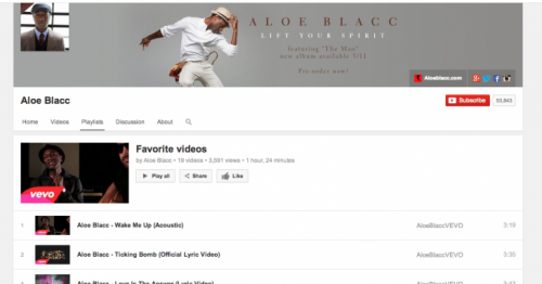
YouTube has worked a lot on playlists to streamline the search process, eliminating the previously required step to view videos in a specific playlist after it has been linked. Before the update, users had to navigate to their account’s guide to locate the playlist they want to watch, click on it, and the playlist would open in a separate window. Whereas now, you can view playlists directly from your guide screen, irrespective whose playlists they are – yours, or those of channels you subscribed to.
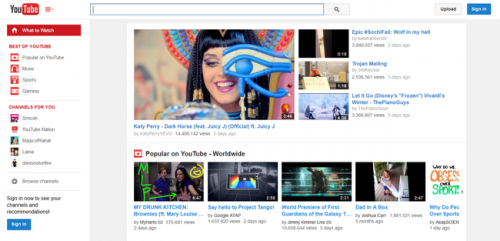
The design has been revamped, too, in an effort to make YouTube’s web interface in line with its mobile counterparts. The layout is more center-aligned, clean and puts the focus on videos. Logged in users have two links at the top of the screen to navigate to recommended videos or subscriptions.
You can also find your guide icon located next to YouTube logo to view subscriptions, playlists and other options normally available through guide.
The new tweaks to UI have been implemented to “help people find, watch and share videos that matter most to them more easily,” said YouTube’s spokesperson.
Has the update rolled out to you already? What do you think of the new layout? Share your thought with us in the comments below.


