StumbleUpon Overhauls iOS App With Activity Center, New UI and Extras
StumbleUpon is one of the more mature web brands that lets users share good content on new and upcoming web sites. Web sites in turn share their stories on StumbleUpon hoping to catch a wave of interest from like minded readers. Each member of StumbleUpon checks out approximately 300 items each month. The platform as a whole makes more than half a billion recommendations on content each and every month.
The StumbleUpon app for iOS users has been significantly updated with many changes and improvements while keeping core features in tact.
User Interface
The new user interface includes the ability to create custom lists. The navigation has been overhauled to now include interests, likes and followers all accessible with a single tap on the screen. There are other visual tweaks and the app is noticeably faster than before too.
Social Chatting
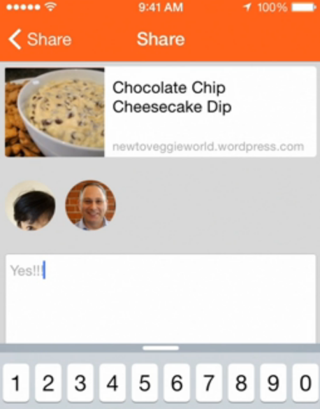
The iOS version of StumbleUpon has just been overhauled. A new chatting interface has been added to let members discuss with each other what content is best and why. See piece of content, tap on a member in the list and talk about it. The social chatting could lead to considerably greater usage statistics for the platform and the apps for the service.
Every user being shared with is displayed as a round profile image using their member photo. It is possible to add text with the link being shared which adds an element of a full conversation whereas before it was simply sharing a link and that was all.
Activity Center
When web pages are shared with you, they will show up in your own Activity Center. This area keeps a tap on all the new shares made to you. For any member you have chosen to follow it will also display appropriate notifications that you have requested to be updated on.
The thinking behind the changes clearly seems to be a mix of a chatting and a social platform in one. This takes the StumbleUpon service a little away from its roots as a purely a content sharing and content discovery tool into something that is more communal and communicative. This marries media consumption with social chatter which could take the app in a whole new direction for those who wish to become involved in the ongoing dialog. For those who don't, they can still use StumbleUpon simply as a content tool as they did before which will help avoid alienating previous users.
It was possible previously to share new content via SMS text messaging, but the above changes make more of an effort to keep users inside the StumbleUpon app. Link sharing for content, user comments and notifications turns the app into something of an overlap with elements of Facebook, Twitter, Reddit and Digg all rolled into one. Interesting.


