Review: Inbox by Google
 I received my Inbox invitation among the second wave of invites, according to my own estimation, so I've had some time to get used to the new interface and fiddle with it. If you are getting impatient about laying your hands on the new app, don't because:
- You will receive that invitation if you send a request to inbox@google.com
- You can bypass that invitation restriction if you have a friend with activated Inbox. All you have to do is install the app on your device and run it with your friend's credentials the first time. From there, you just add your Gmail account, delete your friend's account and go on using your brand new Inbox.
- Your friends who already have Inbox must have three invites to send to their friends. It's above the red + button at the bottom right corner, which expands into a quick start menu.
Before you rush, though, bear in mind that:
- Inbox currently does not work with Google Apps for Work.
- You will need to install the Inbox mobile app and log in to it with your Gmail account (the one that received an invite) on your mobile device first. Only then will you be able to log in to Inbox web interface from your desktop browser.
Without any further ado, here are my first, second and third impressions, as well as the after thoughts.
UI
The first impression was largely negative despite the good looking design. The new layout and the way the buttons are placed, or rather hidden, is not intuitive.
Yes, it takes some time to get used to, and yes, you will figure it out eventually, but no, I can't say Inbox is as intuitive as Gmail was.
I love the new Material design with its bold colors and lots of clean space. The UI does look uncluttered and clean, but the luxury comes at a price. Where Gmail displayed some eight emails on a single screen, plus the regular functional buttons, Inbox displays significantly less data on one screen.
Does it look good? Yes. Will you have to tap more to do the same things? More yes than no.
Inbox Puts to Test Your Organizational Skills
Having postponed the review for over a week, I now look at Inbox from a different angle. First of all, the way your Inbox looks depends largely on how well organized was, and is, your Gmail. If you never bothered with tabs and labels, and all you email went straight to inbox, your Inbox app will most probably look like nothing usable.
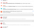
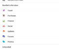
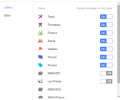
On the other hand, if you have been compartmentalizing your emails, Inbox translates that in a pretty understandable structure. On the main page, you will see a quintessence of your labels, or Bundles in Inbox. The thing is Inbox sorts your emails the 'smart' way according to their contents.
As a result, your financial emails, receipts, and the like will go directly to Finance bundle, even if you haven't labelled them in Gmail. The same is true about Travel-related information - bookings, tickets, confirmations and the like.
Your Forums, Subscriptions, and Social labels from Gmail, if you have been using them, will translate to the same Bundles in Inbox.
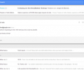
As I said, the Inbox' main screen displays the intro to all of them, and Today is the first in line, with everything else below it.
No Tabs
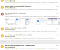
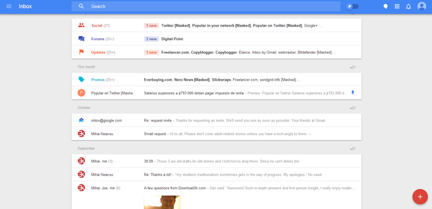
The thing that I did not like at first was Inbox has done away with tabs, replacing them with expandables. So, when you tap one of the Bundles, it will expand displaying the e-mails' short contents. You can contract it just the same by tapping on the bundle, and continue with the other bundles.
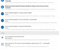
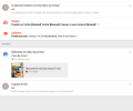
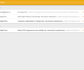
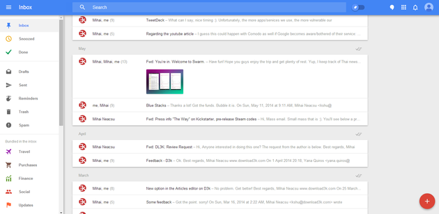
Inbox web interface
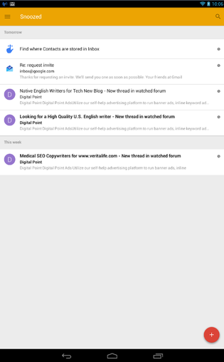
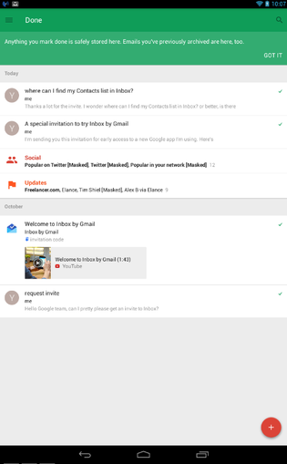
Pins, Reminders, Snoozed and Done
Among the nifty features in Inbox are the Reminders, Snooze and Done. You no longer need to send yourself emails to remind of something, although I doubt anyone was ever doing that with all the multitude of reminding and to-do apps for mobile. However, in Inbox this feature is very handy - create a reminder and set the exact time when you want to be reminded of the task - you no longer need a third-party app for that.
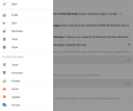
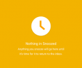
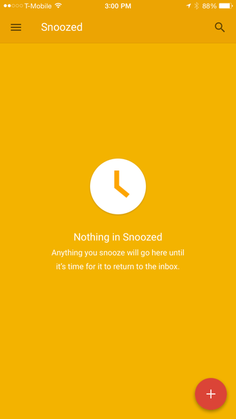
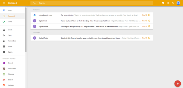
Snooze feature works similarly - choose the time and date you want to get back to the particular e-mail, and tap Snooze or swipe it left. Done feature sends the processed e-mails, the ones you are done with, to the Done folder, which is Archive in Gmail.
Material Design - love it or hate it, can't change it.
I have heard the first testers there is no Delete button, but now you can send e-mails to Trash from Inbox, too. I am not sure why you can't empty Trash from Inbox just like you would from Gmail, and I believe this is something Google will be nagged about a lot.
No Contact List
The next thing that I find inconvenient is the Contacts in Inbox, or the absence of whereof. You know how you can switch to the Contacts view in your Gmail, and view, sort and mingle with all the contacts? Well, it does not seem to be anywhere in Inbox, so to work on that you will need to switch to Gmail app.
Composing a new e-mail in Inbox takes one tap on the big red + button, and you have to remember at least one letter from that recipient's e-mail address to see the list of suggested addresses. It's great for the cases when you remember how it goes, but it's not very convenient when you'd rather scroll through a list of contacts.
Searching Is Nice
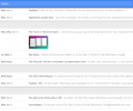
The after taste keeps changing with every day. Inbox is really great for fast scrolling through loads of emails when you are not sure how to approach the search. The thing is Inbox displays e-mails with photo previews, and generally, searching in Inbox is pretty convenient.
On the flip side, Inbox feels like an alien body where Gmail felt like second skin, and even though I am determined to use it for everyday e-mail chores, I still find myself reverting to Gmail. That said, Inbox must be a game changer for those who do e-mail as an integral part of their work, which I don't. This assumption makes it even more strange why Inbox does not work with Google Apps for Work.
No Skins, or Themes
Oh, and you can't change the color scheme in Inbox. I know it's not a deal breaker, but some like it dark, some like it light. Material Design is pretty tyrannical imposing the new looks on all users, whether they like it, or not.
Pros
- Snooze, Done and Reminders feel like they always should have been there
- Pinning keeps the pinned email on top of your Inbox
- Bundles are easy to browse and Inbox organizes your emails in a very smart way, provided you organized it in Gmail
- Inbox makes searching large volumes easier since the app's algorithms are a lot more sophisticated than Gmail's
- Material Design looks flat, clean and stylish
Cons
- A style that is too uncluttered means more buttons are hidden, and less emails are visible on the single screen
- Inbox is less intuitive than Gmail
- In terms of sorting, I am happy with Primary, Updates, Forums and Promotions in Gmail, and bundles in Inbox don't always sort emails the way I see it, but then, being a smart app Inbox will most likely learn from my behavior
- No Contacts page as in Gmail
- No exact time details for emails as in Gmail
- Unbundling emails is more difficult in Inbox than drag-and-dropping emails from one tab to another in Gmail
- No way to change the color scheme
- No tabbed view, just expandable Bundles
- You must install the app on your mobile device to activate Inbox, which I think is just another way of pinpointing users' mobile devices and tying them up with their Google accounts, because ultimately, Inbox works in any desktop browser.
- Another note for the paranoid - Inbox is smarter that Gmail; it reads your e-mails, pinpointing data that matters. It is a good thing productivity-wise, but raises even more concerns as to how Google uses that data except for directing relevant ads at you.
Conclusion
It may be the case that Google sees the future of email as Inbox, and just as Lollipop is an evolutionary leap for Android, Inbox is a revolutionary change for Gmail. It is also in a testing mode, and potentially may undergo changes. An abrupt switch from tabbed view to expandable Bundles is awkward, and the new Material Design takes too much stuff away along with the clutter, but it does look good. I love how you can see the contents of emails containing images in the preview, and Snooze coupled with Reminders is a very neat feature, but as of now, I am not ready to switch completely to Inbox and dump Gmail.

