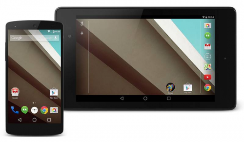
Android L - Biggest Android Update Ever, Set for 4th Quarter 2014 Release
Last month at the 2014 I/O Developer's Conference, Google revealed an interesting preview of the upcoming Android 'L' operating system. The new version will feature a completely overhauled UI, and is being labelled the biggest update in Android history. The release date is set to come in the 4th quarter of 2014, and the update will most likely hit Samsung, Sony, HTC, and Nexus devices first.
Development Version Already Available
Although the official release of the new-and-improved Android is expected to take place later this year along with the introduction of two new mobile devices from Google (the Android Silver and Android One) there is already a developer preview version of L that is currently available for the Nexus 5 and Nexus 7. We should note that Google is supposedly only using the nickname L as a temporary title, and that a more extensive, more official moniker should be revealed upon the release of the update (the most popular speculation is that it will be called 'Lollipop' in line with the candy/dessert theme Google has been using).
Introducing Material Design
Experts are calling this update the most extensive visual change to the Android UI since 4.0 (Ice Cream Sandwich) was released. The aesthetic revamping is part of a new initiative from the Android development team called “Material Design.” Most analysts have formed the opinion that L takes aspects of Android's two leading competitors – Windows Phone and iOS – and molds them into one highly efficient operating system.
The goal of the Material Design initiative is to create a mobile platform in which digital objects react to your touch and input in the same way a physical material would. This is all part of an ongoing effort to make Android a more interactive, responsive, and realistic experience. Some of the main components that have been tweaked include system font, icon design, animations, and menus.
The Biggest Android Update Yet
The introduction of the new theme will facilitate a radical change from the Android interface you're used to, similar to how Windows changed so drastically when Microsoft introduced the Metro view in Windows 7 and 8.
All native Android apps will now have a unified color scheme that matches the color spectrum of apps like Google Now and the Play Store. A new feature in the updated SDK will let developer's render objects in flexible layers, giving the appearance that items are floating on top of each other. Google has compared these virtual layers to stacks of flexible paper. Most components are slightly shadowed to portray depth without causing screen clutter.
Google appears to be extending the card-like Google Now template to other parts of the operating system. However, the launcher and icons still look the same as KitKat (with the exception of the Settings icon, which has been changed completely).
Improved Transitions and Animations
Another aesthetic aspect that is undergoing a major overhaul is the appearance of transitioning and animations. Every transition within Android is being revamped to include an animation of some sort, even if it is a very brief animation – there will most likely be no more unsightly flash transitions.
If you'd like to learn more about what makes Android L such a special and rare update, you might want to check out this video from Google Developers showing what the new theme looks and behaves like:

